Showing posts with label Print. Show all posts

26 January 2012

The Fool's Gold Artist Series presents Haze

Link: Haze
Link: Fool's Gold

The third event in the Dust La Rock curated Fool's Gold Artist Series boasts Eric Haze.

Responsible for the iconic logos used by Public Enemy, Stussy, EPMD, LL Cool J and the Beastie Boys, Haze now brings new imagery including limited edition t-shirts and prints to the Fool's Gold label's store at 536 Metropolitan Ave, Williamsburg, Brooklyn. It all happens 27th January.


3 March 2011

Revolutions: The Album Cover Art of Shepard Fairey

EXHIBITION DATES:
3/12 - 4/23/11

ROBERT BERMAN GALLERY C2
2525 MICHIGAN AVE
SANTA MONICA, CA 90404


OBEY GIANT ART X SUBLIMINAL PROJECTS X ROBERT BERMAN GALLERY ARE PROUD TO PRESENT REVOLUTIONS, A PROJECT FEATURING THE ALBUM COVER ART OF SHEPARD FAIREY. ON EXHIBITION FROM MARCH 12TH THRU APRIL 23RD AT ROBERT BERMAN'S C2 GALLERY, WILL BE OVER 80 PIECES OF PUNK, ROCK, NEW WAVE, JAZZ, AND HIP-HOP INSPIRED ARTWORK BASED ON THE 12" RECORD COVER FORMAT. TO MARK THIS OCCASION, TWO SPECIAL LIMITED EDITION ALBUM COVER PRINT BOX SETS WILL BE RELEASED FOR THE EXHIBITION.

"LONG BEFORE I KNEW ABOUT ART GALLERIES OR EVEN STREET ART, I WAS EXCITED ABOUT ALBUM COVER ART, IF ONLY BECAUSE IT WAS THE VISUAL COUNTERPART TO THE MUSIC ON THE RECORDS I LOVED. ALBUM COVERS CONJURED A EUPHORIC ASSOCIATION WITH THE LISTENING EXPERIENCE. MOST OF MY EARLIEST HOME-MADE TEE SHIRTS WERE STENCILS BASED ON PUNK ALBUM COVERS. I'VE HAD SOME VERY MOVING ENCOUNTERS WITH ART IN MY LIFE, ESPECIALLY IN THE STREET, BUT ALMOST NOTHING CAN COMPARE WITH THE FIRST TIME I HEARD THE BOOTS MARCHING AND FIRST CHORD OF THE SEX PISTOLS' HOLIDAYS IN THE SUN, OR THE AIR RAID SIRENS LEADING INTO "TOO BLACK, TOO STRONG" ON THE INTRO TO PUBLIC ENEMY'S IT TAKES A NATION OF MILLIONS TO HOLD US BACK, OR THE OPENING GUITAR SCREAM OF BLACK FLAG'SRISE ABOVE. THOSE SONGS DID, AND STILL DO, MAKE MY ARM HAIRS STAND UP. MUSIC IS VISCERAL AND ACCESSIBLE, BUT ALSO HAS THE ADDITIONAL POWERFUL LAYERS OF THE LYRICS, WITH THEIR CONTENT AND POLITICS, AND THE STYLE, POLITICS, AND PERSONALITIES OF THE MUSICIANS THEMSELVES. NO MATTER HOW MUCH I LOVE ART, OR TRY TO CONVINCE MYSELF OF ITS RELEVANCE IN SOCIETY, THE FACT REMAINS THAT MUSIC IS A LOT COOLER AND WAY MORE ABLE TO REACH PEOPLE'S HEARTS AND MINDS' BUT I'M A POPULIST AND I LOOK AT THIS WAY: I MAY NOT PLAY AN INSTRUMENT, BUT I'M GONNA ROCK IT HARD AS NAILS ANYWAY. WITH MY ART I TRY TO CAPTURE THE SAME ENERGY AND SPIRIT THAT MAKES MUSIC SO POWERFUL AND DEMOCRATIC. REVOLUTIONS IS A CELEBRATION OF ALL THE GREAT MUSIC AND ACCOMPANYING ART THAT HAS INSPIRED ME OVER THE YEARS."

- SHEPARD


12 February 2011

Sleeping Beauty Ballet Suite sleeve by unknown designer

Link: Re:collection

Archiving Australian graphic design artefacts, Re:Collection posted this World Record Club sleeve from the 1960s. Unfortunately there is no designer credit so it's impossible to determine who devised this graceful suggestion of movement.

21 January 2011

Lykke Li - Wounded Rhymes by Leif Podhajsky

Link: Leif Podhajsky

After gaining attention for saturated psychedelic sleeves for Modular band Tame Impala, Leif Podhajsky's work for Lykke Li employs a moody monochromatic approach. It also abandons the symmetry that is usually associated with Podhajsky's imagery.

Released next month, the album Wounded Rhymes will additionally be available as a collectors edition complete with vinyl, CD and high quality digital files plus a bonus pre-order track and, for the first 500, a numbered lithograph print.

Limited edition: Wounded Rhymes
Standard CD edition: Wounded Rhymes


18 January 2011

The Emperor Machine artwork by La Boca

Link: La Boca

Despite justifiably receiving a lot of attention for the geometric approach created for Muse, I'm even more enamoured with La Boca's designs for The Emperor Machine. Maybe it's the retro-futurism of the typography or the quirky yet unsettling lo-fi imagery [that seemingly recounts obscure old library recordings and Krautrock oddities] but - either way - it's a strong aesthetic that fits perfectly with The Emperor Machine's spaced-out psyche-disco.


11 January 2011

Impotent Fury sleeves

Design: Airside
Made by: ThinkTank Media
Record Label: Impotent Fury

Keeping the physical format alive are these lavish limited edition 7” sleeves designed by Airside with Fred Deakin supplying the the tracks inside.

Processes : hand screen printed in white onto 6 different coloured porous cairn boards clear foil blocking + numerous circular die cuts.
Pushing the boundaries of music packaging alive as ever.
A superb collection of unique unbranded sleeves for ultimate creative license.

As Creative Review noted, the use of printed varnishes around the die-cuts gives the impression of further layers.

ThinkTank, meanwhile, has facilitated some other great packaging solutions including projects for NinjaTune, Radiohead and The xx.


24 August 2010

Un-Convention

Tash forwarded an email that called for poster designs as part of the Un-Convention conference/festival that comes to Salford in October. There were guidelines concerning the text that needed to be included although complete freedom was offered regarding the imagery.

I decided to quickly submit one based on an idea I'd jotted down in a current sketchbook. It's a continuation of ideas surrounding unplayable media, format destruction, music as 'product' and the fetishization of music hardware.

The organisers will be selecting some to be screen printed by the lovely people at Hotbed Press so I wanted to ensure that the design was simple enough so that, should it be chosen, it would allow for the three colour process to add that additional detail. [I thought it would look good should the grey be printed silver. Maybe on an off-white or pale grey stock.] Anyway, we'll see...

Meanwhile I may be doing something else as part of Un-Convention. I'm just waiting for details/confirmation.

23 August 2010

Brian Eno - Small Craft On A Milk Sea

Electronica/ambient nerds will currently be salivating over this.
352gsm.
Phwoar.


New album on Warp Records

out 2nd November 2010 (15th November in the UK)
With Jon Hopkins and Leo Abrahams

* Limited Edition Box Set
* Collectors' Edition Box Set
* CD & High Quality Download
Limited Edition Box Set (Heavyweight vinyl, 2xCD, Lithographic Print)

Packaged in a rigid, Birch paper-covered slipcase with printed and foil-blocked cover and spine, this edition includes:

* 180g heavyweight, double disc 12" vinyl pressing of the album, in full-colour, case-bound 12" cover. Lined in crimson stock with foil block.
* CD pressing of the album, along with extra disc containing four extra tracks, in full-colour, case-bound 12" cover. Lined in crimson stock with foil blocked credit sheet.
* High quality 12" square lithographic print of new Brian Eno artwork, printed on 352gsm Mohawk Superfine stock, presented in full-colour, case-bound 12" cover. Lined in crimson stock with tissue paper protection.
* Audiophile quality downloads : 24-bit WAV album AND 320kbps MP3 album delivered digitally on day of release.

Collectors' Edition Box Set (Unique signed, numbered screen print by Brian Eno, Heavyweight vinyl, 2xCD)

This strictly limited edition of 250 worldwide includes everything in the Vinyl Edition with the following, one-of-a-kind additions:

* A one-off, entirely unique and customised 12" square silkscreen print by Brian Eno. A print application of the generative process that Brian has been developing throughout his career, each print will be be a unique combination of screen printed elements by Brian Eno and Nick Robertson. Printed on 330gsm Somerset Radiant White stock, signed and numbered in pencil by Brian Eno. There are no duplicates. The printing process will be fully documented.
* A real copper plate, etched with the title and edition number embedded in the slipcase spine.

*Please note no edition number or specific print can be reserved from this edition. Allocation to customers will be random.

CD

* CD album packaged in an 8 panel digipack
* Bleep customers will receive instant digital downloads following the release date


High Quality Download

24-bit audiophile quality WAV downloads from Bleep.com, 16-bit WAV downloads plus standard MP3/AAC downloads.

Download from Bleep, iTunes, Amazon and other stores from release date


19 August 2010

Ian Wright - Printed Records

Originally known for his tribal-like illustrations for Straight No Chaser magazine's jazz-oriented favourites, Ian Wright's more recent work has explored the use of the pixel while building iconic images out of everything from badges to mascaras.

I was looking for an image that I remember seeing a while ago that employed the use of a TDK blank cassette but I couldn't find it. However, what I did find was these prints created by inking up records which, after seeing Tal Brosh's use of vinyl to emboss, was something I was going to attempt.

"Playfulness is important to me; I’m motivated by trying to push my work somewhere new. Somewhere else. Really, I’m interested in what could be. I sometimes reach that point by making mistakes and generally misusing technology and I often arrive at solutions by accident. I prefer to let the materials I use influence the outcome. I especially enjoy making portraits and I’m excited by the process of collaboration. I love conversation. I’m obsessed by music. I’m looking forward to what happens next."

Illustrator Ian Wright
http://www.mrianwright.co.uk/


17 August 2010

Folkways

From: Creative Review

Date: 22/03/10
By: Mark Sinclair


Unit Editions' first newsprint publication unearths a selection of covers that Ronald Clyne designed for esoteric US record label, Folkways. The work, and the story of the label's almost sacred mission, make for a compelling read...

Clyne, who died in 2006, made over 500 sleeves for the Folkways label, which was founded by Polish-born Moses 'Moe' Asch in New York in 1948. Under Asch's direction, the label evolved into a fascinating repository for field recordings, spoken word, poetry and indigenous compositions.

The label helped to bring native folk traditions to a wider public and recorded, among others, Lead Belly, Burt Ives, Woody Guthrie and Pete Seeger. Bob Dylan was also a fan of the label's output and recalls his early ambitions to record for the label, as a natural home for his music, in the first part of his Chronicles autobiography.

In one of two essays bookending the Unit Editions collection, Adrian Shaughnessy suggests that Folkways had the characteristics of "a social enterprise", that it was almost "a non-for-profit organisation." Clearly not in the business for financial gain, the scale of "musical bio-diversity" that Asch presented through his label is incredible.

There are the songs of the Ulster Orangemen and collections of Catalonian folk artists; psalms from Cameroon and modernist poetry from Charles Olson. Sir Edmund Hillary's reminiscences of his mountaineering campaigns even made it onto vinyl – one of over 2,000 albums that emerged from the label.

If Folkways had a remit it was, as Asch himself put it, "Anything that is sound, from Indonesian folk music to James Joyce reading his own poetry."

Yet however diverse and appealing Folkways' subject matter was, Clyne's creative work for the label has largely been ignored by design history. From the 1950s to the 1980s he designed hundreds of covers, working on sleeves for many of the recordings by electronic, avant-garde and jazz artists, in addition to the label's folk releases.

Clyne was apparently an avid collector of art from New Guinea and Vanuatu and many references to ethnic art and design feature on his sleeves. Indeed, all of his cover designs have, says Shaughnessy, "an unpretentious, unselfconscious graphic purity" that make great use of two-colour printing on matt paper.

This production process was in part an economic strategy, but one that became an integral aspect of Clyne's approach which remained un-showy, understated and, like the Folkways sound itself, authentic throughout.


Unit: Design/Research 01 – Ronald Clyne at Folkways is available now (£7.50 including p&p) from uniteditions.com. Editors: Tony Brook and Adrian Shaughnessy. Design: David McFarline and Claudia Klat at Spin. Project co-ordinator: Natasha Day for Unit Editions.

In 1987, in accordance with his wishes, Moe Asch's family transferred the Folkways label to the Smithsonian Institution in Washington, with the proviso that all 2,168 albums remain in print in perpetuity. (A quick search and I've already got some "Tuvan multiphonic throat singing" bookmarked). There is also a filmed interview with Clyne at the Smithsonian Institution site here, and more on Moe Asch at Ralph Rinzler's Folklife Archives and Collections website, here.


Hot Chip work by Wallzo

I referenced some music sleeve/packaging designs over the past couple of weeks purely for their aesthetic style. Others I've posted as they take a different approach to physical products or have some thought-provoking rationale behind them.

One aspect that the Tom Hingston or Ben Drury posts touched on with regards to their respective Massive Attack and Mo Wax work is the idea of a series that can only come from a long relationship with a musician or label.

Many visually interesting music items are part of release 'campaigns' where a different designer will take on an album and its singles. The baton is then handed to the next studio for the subsequent long-player's campaign. I suspect that part of this is down to the the musicians or label owners having an approach to commissioning that is linked to curating a personal collection. Although there is a suggestion that a different aesthetic approach to each stage in an artist's career is in tandem with the alternate sonic 'direction' of each album: that these phases might require a markedly distanced visual style.

Hot Chip has avoided this creative 'relay' by instead opting to collaborate with designer Darren 'Wallzo' Wall for the band's three albums and each one's selected singles. This has resulted in a trio of clearly defined campaigns that still have very different solutions.

I thought that Wall's discussion of the development process for each of these was particularly enlightening. Additionally I can also see the benefit in a single designer being able to apply a rationale and depth of understanding to a catalogue of releases over a disparate design that comes from a single campaign pitch and that more fleeting involvement.

Following interview from It's Nice That.

Wallzo / Hot Chip

* Posted by Will 2 February 2010

Yesterday saw the launch of the fourth Hot Chip album, One Life Stand and with it saw London based designer Wallzo successfully design the third consecutive album artwork. With rave reviews filling many of the weekends papers and music press we thought we’d check in the Darren Wall (aka Wallzo) to find out more about the artwork.


Evening Darren, following on from The Warning and Made in the Dark you’ve just designed the latest record from Hot Chip, One Life Stand, does it get easier year on year?

Yes, I think I was a lot less nervous about this one. When I did the first album, The Warning, I created a cover with no prior understanding that it would become so well-known. Of course this was a really wonderful experience for me and I was hugely grateful for the chance to get my work seen by so many people, but when it came to sit down and tackle the second album cover I must admit I felt the weight of expectation upon me. That pressure is good of course – it makes for good work – but now its much more self-imposed than anything else.

Is there a conscious effort to do something completely different, keep certain things the same?

After each two year gap, personal influences and tastes are always a little bit different so between myself and the five band members, we always end up doing something different. I work closely with Owen Clarke from the band on the initial ideas, and we have hugely overlapping tastes, so after an evening talking about ideas we normally get to a core aesthetic that we can then experiment with. The band are generally happy if Owen is happy, so its good that we share such similar tastes. That said, we always seem to gravitate towards ‘mysterious objects’ that invite interpretation; the blocks from The Warning, the artifact from the Made in the Dark campaign, and now, of all things, a suspended marble head.

What’s the idea behind the current artwork?

When statues are installed or transported they are often lowered into place with large, colourful canvas slings. Owen had a few photographic examples of this in action and they seemed to create an interesting theme; classical forms intersected with bright stripes of colour. The idea of a head seemed to appeal to the band most of all, and from there it all came together after lots of experimentation. There’s plenty of Giorgio de Chirico and Hipgnosis reference in there too. I think its essentially quite an over-the-top image – like a prog-cover reduced to a screen-print. The most enjoyable part of the process was working with the Vinyl Factory who created the 12” versions of the album. The special edition is a 2-disc gatefold with an art print and we’ve even printed a pattern hidden on the inside of the sleeve.

What are you listening to at the moment?


A friend of ours; Rob Smougton operates under the name Grovesnor and makes music like a laser-guided Hall and Oates. He’s just been signed to Lo Recordings and his forthcoming album will soon be graced with a cover from none other than Non-Format. If his music doesn’t make you smile, then something has gone awfully wrong. You can hear his music here.


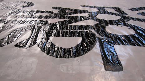
I'm very interested in Wall's approach for 'Made in the Dark' - Hot Chip's second album. Exploring the oxidising of copper for the print process (in addition to also devising a die-cut poster version), he developed a series of circular forms. Especially his discussion of the one from the album cover as 'the Artefact'. Plus, for me, The Warning's a whole catalogue of esoteric shapes/ambiguous objects also links Wallzo's work with the Matthew Dear 'Totem'.


12 August 2010

The Return Of Liner Notes: Scion Releases Album As Booklet

From: PSFK
Date: 11/06/10

Scion A/V is releasing a new album called Blu Jemz’ Night People, featuring Turntable Lab Radio’s Blu Jemz along with The Hardy Boyz, Mobroder and several other artists. The launch is unique as there is no music CD or physical media involved; instead, they have put together a booklet with extensive liner notes and a link to download the songs. Liner notes, rarely featured in music releases now, are usually printed on the inside of an album and contain information about the artists, lyrics and some anecdotes about the album. Blu Jemz said that with re-introducing liner notes, they hope to bring back the excitement it brought to an album.

The booklet is designed by Japanese illustrator Rimo, and is limited to only 1000 copies.


9 August 2010

Gig posters by Telegramme

More examples of the effort that is being put into devising eye-catching gig posters. These are by the formerly Cornwall and Bristol but now London-based duo that operates as Telegramme. [Other exponents of quality gig posters that I should reference quickly are Sonnenzimmer's Nick Butcher and Nadine Nakanishi plus the very influential Jay Ryan. There are also hundreds of lesser known practitioners featured at www.gigposters.com]

I particularly like the way that Telegramme have managed to focus on location for their Arctic Monkeys series: taking design inspiration from where the gig is set to take place. Although, for me, the colour use and addition of intricate pattern does recount some of Shepard Fairey's output. Style-wise, I'm more attracted by the Mum piece that boasts the kind of tesselated structure that has also drawn me to some of the work by Siggi Eggertsson and Andy Gilmore.


8 August 2010

Ghostly International Editions

Ghostly has to be one of my favourite labels and I referenced Mike Cina's work for the company during my last project. The symbiotic relationship between music and art has proved inspiring and, especially after news of the Matthew Dear 'Totem', I'm really interested to see how they further develop the approach to physical products in the digital age.

Here is another aspect to what the label is doing with the availability of images created as 'packaging' now becoming available as prints alongside digital downloads of the associated music.

The press release:

Visual art has always played an indispensable counterpoint to Ghostly International's musical releases. With this in mind, we've introduced an exciting new addition to The Ghostly Store's repertoire of custom apparel and hand-picked, can't-live-without-'em goods: Ghostly International Editions. Our new art section will feature an ever-growing selection of open-edition and limited-edition prints from Ghostly's renowned family of visual artists, along with work from talented new collaborators.

This spring, The Ghostly Store made its first foray into this field with signed, limited-edition prints by longtime contributor Michael Cina. These archival prints feature artwork from Ghostly releases such as The Sight Below's Glider, the state-of-the-label compilation Horizon Line / Ghostly By Night, and Grand Valley State University New Music Ensemble's Terry Riley: In C.

Looking forward to the months (and years) ahead, Ghostly International Editions will release prints in two perennial formats: the PDL and the Art Print. When the cover art for a new (or back-catalogue) release lends itself to the print format, we'll offer an open-edition PDL (print + download) version. Larger than a CD but smaller than an LP, these 10" x 10" archival prints will be sold with a digital download of the album.

In conjunction with the PDL, Ghostly International Editions will be releasing limited-edition art prints featuring original artwork from collaborators including Michael Cina, Andy Gilmore, Will Calcutt, and many more.

Both the PDL and Art Print are printed using archival ink on photo rag paper and will include artist signed certificates of authenticity. We've carefully considered the pricing for both formats: PDL will be an affordable $25, while the larger, limited-edition art prints will generally cost less than your monthly cellphone bill.


Tape inserts

Considering past formats, there is a great selection of vintage blank tape inserts collected on Flickr here. Some interesting design aspects amongst them: specifically in terms of layout, logo, type, print and colourway.