Showing posts with label Illustration. Show all posts

17 January 2014

Kate Moross - Make Your Own Luck

Link: Kate Moross
Link: Studio Moross
Link: Prestel Publishing

Been excited about this since Kate Moross first mentioned it and now her first proper book-shaped round-up of occasionally triangle-obsessed work tops the graphic design pre-order list at Amazon. Although much more than a graphic designer, it also features her illustration output whilst simultaneously demonstrating advanced abilities as an entrepreneur and all-round inspiration. There's also a foreword by Neville Brody but Kate's own overview of her creative process already makes this an essential purchase.

Amazon link: Make Your Own Luck: A DIY Attitude to Graphic Design and Illustration


30 October 2013

For The Record #6: Kate Moross

Link: Kate Moross
Link: Studio Moross
Link: Stiff Records
Link: Design Manchester 13
Link: Paul Gorman's Reasons to be Cheerful book


Ahead of her talk at Design Manchester 13 tomorrow (alongside Malcolm Garrett, Peter Saville and Mark Farrow, no less), Kate Moross selects the Kandinsky-inspired 1977 work by Barney Bubbles for The Damned's Music For Pleasure as her personal favourite sleeve.

"I didn't know what it was when I first found it but I loved it immediately," she says. "Some people will obviously know about Barney Bubbles but I still don't think he's had the recognition that he deserves. Not when you consider the amount of great work he did.

"I've got to know Bubbles' biographer Paul Gorman and he's said that he sees some of him in me. Not necessarily in terms of our styles... but it's a huge compliment."


Kate Moross' own book, Make Your Own Luck, is published by Prestel April 2014.

Manchester Confidential also has a feature on Design Manchester 13.

29 March 2013

Mount Kimbie - Cold Spring Fault Less Youth artwork by Leif Podhajsky

Link: Leif Podhajsky
Link: Mount Kimbie
Link: Warp

With that amazing Horrors box set recently unveiled plus an archive of visual material for names like Foals, Bonobo and Tame Impala, Aussie artist Leif Podhajsky's kaleidoscopic view of the world is well established. However his latest imagery for Mount Kimbie's upcoming long-player takes a more restrained graphic, almost mid-century approach yet it simultaneously appears to nod towards Matisse's collage work and, pioneer of the album cover, Alex Steinweiss. So while Podhajsky's more psychedelic offerings will continue to thrill, it's great to see the arrival of this other, cleaner but equally intriguing aesthetic.


6 February 2013

Dinos Chapman - Luftbobler design by FUEL

Link: Fuel Design
Link: The Vinyl Factory 

Limited Edition details:
  • Four plate copper etching by Dinos Chapman, hand coloured on 300gsm Somerset Velvet soft white paper
  • Five colour screen printed artwork across four panels of cloth-bound bespoke board
  • Two 180-gram heavyweight hand etched records, containing the album's 13 tracks, pressed on the EMI 1400 in Hayes, Middlesex
  • Limited to 300 copies worldwide, each hand signed and numbered by the artist
  • One in every 10 copies contains an exclusive bonus track, pressed on an additional one-sided 12"
  • Mastered for vinyl by Noel Summerville at 3345 Mastering
  • Music written and produced by Dinos Chapman
  • Original etching by Dinos Chapman
  • Design by FUEL

One in every 10 copies also contains an additional one-sided 12" vinyl pressing of an exclusive bonus track, which will never be subsequently released on any format.

This limited edition is available to pre-order now. The Vinyl Factory will release 'Luftbobler' on gatefold vinyl, CD and digital formats on 25 February 2013. An accompanying, site-specific audio-visual installation will take place at The Vinyl Factory in Soho, London from 28 February to 3 March 2013.

Pricing:
  • The first 100 copies of this edition will be priced at £200
  • The next 100 copies of this edition will be priced at £250
  • The last 100 copies of this edition will be priced at £300


18 December 2012

'Dalston Fried Chicken' from MarkJames_Works and Unbox Industries

Link: Mark James_Works
Link: Unbox Industries


Inspired by hazy late night visits to fast food outlets, Dalston is six inches of finger lickin’ fried chicken presented in vinyl. Delivered in a hand screen printed box, and limited to 200 pieces. 

DFC also comes with a deep fried orange 7” single featuring a brand new track, 'Chicken Rhythm' by Gareth Goddard, (Cherrystones)

Also available will be a limited edition screen print and T-shirt. 


7 November 2012

The Shee - Murmurations by Lillias Kinsman-Blake

Link: Full story at Computer Arts
Link: Lillias Kinsman-Blake

...Every copy of the album is itself unique. All 2000 of the CDs they've shipped have different patterns of starlings in flight on their covers.
"The conventional method for CD covers is lithographic printing but the flexibility of digital printing made it feasible for each cover to be different," says Kinsman-Blake...


30 August 2012

Nathan Fake - Steam Days artwork and poster by Jack Featherstone

Link: Jack Featherstone
Link: Border Community

Last week's marathon House Party event on Channel 4 paired up a succession of taste-maker DJs with video artists. However, it seemed to reaffirm that club culture struggles as a spectator sport. Some of the VJing  didn't help with any kind of reassessment either - particularly given that much of the visual work resorted to the tired imagery that's already accompanied at least 44,000 Ibiza-oriented compilations. The dancefloor experience was too easily reduced to some animated gifs of speakers and rotating headphone-clad people.

A notable exception was Jack Featherstone who took an interesting and far less literal approach that did more to illustrate the abstract communicative abilities of sound. Which is unsurprising given his output: the latest of which follows on from the series of 12" singles he prepared for the Border Community label.

Contextualizing Nathan Fake's upcoming Steam Days long-player, Featherstone appears to touch on an area that has previously been visited by Andy Gilmore and Michael Cina: courtesy of the construction of a complex, overlapping geometric image. In this case, though, it has resulted in a hypnotic, vortex-like arrangement of light that is perhaps as dazzling as Fake's productions. Released next week on double vinyl, CD and download, there is also a limited edition A2 print of the artwork that's currently available to pre-order at bleep.com.


29 August 2012

Club Cheval & Brodinski - 'Bromance #3' artwork by Viktor Hachmang

Link Viktor Hachmang
Link: Bromance

For the French love-in that is Brodinski and Club Cheval's third release for the former's Bromance label, the artwork depicts similar visual influences to those that have defined the Club Cheval-affliated Marble Music. Created by Holland's Viktor Hachmang - an illustrator whose work can often employ the post-modernist motifs associated with Memphis Group members like George Sowden - this contemporary work is one that owes a debt to Barney Bubbles. In this case its the kind of style used for Bubbles' technical drawing-based sleeve for Ian Dury's 'Hit Me With Your Rhythm Stick' and it is one that additionally features what would have been self-reverential details that relate to the graphic designer of the late 1970s and early 1980s. But, while it may be something of a pastiche, it's obviously something with a real fondness for the era it evokes.

Meanwhile, for a more in-depth approximation of Barney Bubbles' output and influence, Paul Gorman's book comes highly recommended. You'll find that available via this link: Reasons to be Cheerful: The Life and Work of Barney Bubbles.


11 July 2012

Flying Lotus vinyl reissues

Link: Bleep

Following the Sony/PIAS warehouse fire during last year's riots, all of Warp's stock was reported as destroyed. There was also the suggestion that many of the releases would not be re-pressed. However that physical back-catalogue has just expanded with the reissuing of four Flying Lotus vinyl releases.

Both FlyLo's Los Angeles and Cosmogramma albums are available again (complete with their artwork respectively by Build/Timothy Saccenti and Leigh J. McCloskey). Additionally 'Pattern+Grid World' (with its sleeve illustration by Theo Ellsworth) and the 'Reset EP' (Stephen Serrato and Seth Ferris) are now also up on Bleep.com.


21 June 2012

Lorn - Ask The Dust by Jesse Auersalo

Link: Jesse Auersalo
Link: Ninja Tune

The Brainfeeder-affiliated Lorn issued, his second album, Ask The Dust this week. Available via Ninja Tune (with a now sold out reel-to-reel edition and a version on cloudy grey vinyl), it boasts artwork from, Finnish illustrator, Jesse Auersalo.

Auersalo's imagery was previously used as part of Big Active's campaign for Mark Ronson's last long-player although this particular project sees him sticking to the moody monochromatic style that makes up a large part of his portfolio. Additionally the trompe l'oiel concept - evoking Magritte - and the plaster-like texture - adding a touch of de Chirico - makes the cover a beautifully-rendered surrealist work.


Jacques Greene - 'Prism' by Jeroen Erosie

Link: Jeroen Erosie 
Link: 3024
Link: Dummy interview

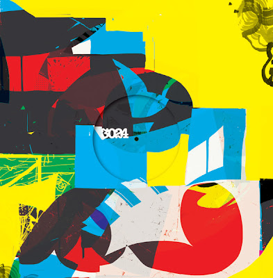
Release 019 on the 3024 label comes from, Canadian producer, Jacques Greene. The artwork is again courtesy of, label co-owner, Jeroen Erosie and continues the specific house style that he's developed through sleeves for the likes of Jon Convex, Mosca, Julio Bashmore and Redshape. As he revealed in an interview with Dummy magazine, he uses the final layer of the previous release for each new piece and has subsequently developed an interesting 3024 continuum within the complex patterns. The latest also appears to have brought in some letter forms with assumedly what is a 'J' and 'G' to correspond with the Greene's intials. The single is out July.


14 June 2012

Shine 2009 artwork by Santtu Mustonen

Link: Santtuu Mustonen
Link: Santtuu Mustonen at Hugo & Marie
Link: Expo

Former industrial designer Santtu Mustonen switched disciplines following his experimention with 3D imaging software. His subsequent illustration work for releases by Shine 2009 then demonstrated a real flair for what he has dubbed "slightly moving images": with some beautiful textures and sophisticated colour palettes. And while one of the singles may have featured Paula Abdul, this is far removed from the kind of visual material that would more usually be associated with anyone on the same payroll as Simon Cowell.


31 May 2012

Teengirl Fantasy - Tracer artwork by Kari Altmann

Link: Kari Altmann
Link: R&S 

After collaborating for the 'Portofino' video back in 2009, Kari Altmann has put together the artwork for Teengirl Fantasy's upcoming album. There is seemingly a kinship with the synthetic qualities of Konx-om-Pax's cover for Lone's Galaxy Garden that was released recently on, the same label, R&S. That said, Altmann's work has explored technology-based aesthetics for a considerable amount of time. A particular interest appears to be based around a 'hacker'-like approach with this - of faked, filtered and modified nature - an unsettling yet dream-like visual to accompany the U.S. duo's maximalist electronic output.


15 May 2012

Gold Panda - 'Mountain/Financial District' 7" artwork by Andy Gilmore

Link: Andy Gilmore
Link: Gold Panda
Link: Ghostly

Released by the US's Ghostly and, in the UK, via the artist's own Notown logo, 'Mountain/Financial District' is the new single by Gold Panda. As with the acclaimed Lucky Shiner long-player, artwork comes courtesy of Andy Gilmore. Out on clear vinyl 7" and (far less fancy) digital.

Gold Panda has described the A-side track as "crowded, synthetic and shiny... repetitive": something that Gilmore appears to have picked up on for the cover image.


5 May 2012

Beastie Boys - Licensed To Ill artwork by Steve Byram

Link: Beastie Boys
Link: Steve Byram

Steve Byram's customised 747 illustration for the breakthrough 1986 album by the Beastie Boys seemingly captured a sense of ambition. However the punchline - via the continuation of the image on the album's reverse - humorously typified the kind of chaos and irreverence that was quickly associated with the trio.

As the tributes to Adam 'MCA' Yauch demonstrate, the Beastie Boys clearly outgrew the associations with juvenile acts of destruction while also creating an impressive and varied body of work. Still, this album - and its sleeve - serve as a reminder of a pivotal point in music history.


*** Update ***


From Manuel Sepulveda a.k.a. Optigram:

"Just thought I'd let you know that the idea for the cover was by Rick Rubin and he asked Steve Byram (art director at CBS) to commission it. The artwork is actually by illustrator David Gamboli, aka World B Omes. The Beastie's logo was designed by Stacey Drummond."


28 April 2012

Shackleton artwork by Zeke Clough

Link: Zeke Clough
Link: Boomkat 
Link: Juno

Three years since the closure of the Skull Disco logo and Shackleton has issued a lavish new package via his Woe to the Septic Heart label. Long-delayed, it incorporates three 'Drawbar Organ' EPs plus the Music for the Quiet Hour album that are on sale as a box set and also individually. The packaging utilises the unmistakable illustrations of Shackleton collaborator Zeke Clough although, unlike earlier releases that may have been a bit too close to the morbid imagery of death metal, this now appears to involve some more refined (yet still psychedelic) Robert Crumb-like penmanship.


Hampshire University Records releases by Julian Montague

Link: Montague Projects

A collection of faux record covers imagined as listening materials for a character within Secondary Occupants: an exhibition by, artist, Julian Montague. In addition to his book and poster designs, each audio item picks up on some of the niche interests of the described collector whilst, in the case of the featured field recordings/Library Music offerings, inadvertently highlights the demand for this type of vintage esoterica.


10 April 2012

Jeroen Erosie interview at Dummy

Link: Jeroen Erosie interview

“Doing the artwork for a wide range of producers is a nice way of looking for this Gesamtkunstwerk approach. In the end, all of this is concentrated on this plastic disc with a piece of cardboard around it."

27 March 2012

Smallville artwork by Stefan Marx

Link: Smallville Records
Link: Stefan Marx

With a style that can touch on both demented scrawls of David Shrigley and the cute naivety of Mr Scruff, Stefan Marx has defined an irreverent aesthetic for Hamburg's Smallville Records. This might be seen as betraying some of the serious (and seriously good) music that both the Smallville label and record store purvey, but then maybe that's the point. There are arguably enough pious techno-oriented outlets typified by impersonal and often minimal sci-fi graphics. So maybe this approach highlights that human touch.


13 March 2012

Mouse On Mars - Parastrophics artwork

Link: Mouse On Mars
Link: Monkeytown

"...We found out about the Shakers — they were similar to the Quakers in the 19th century. They tried to reconsider religion and use America as new ground to do that... They had a very tolerant idea of the non-material world and the idea of Jesus. They had this practice where they drew all these weird maps of things that happened to them in a day, including the ghost world and mathematical formulas. And this whole map looked like a score or a diagram to create a machine. So we used this as the album sleeve — that’s a Shaker design."
(MTV Hive)

"...And then, we found those Shakers drawings, which basically we stole… or took as inspiration for the album. And the Shakers were a weird religious sect because men and women in the group were equal; they had the same rights, for within the 19th century, it was quite radical. They were great craftsmen, but also liberal in a way, very un-dogmatic. And they even had this idea of a metaphysical world that they would deal with in drawings, in craftwork, in poems. So we used this kind of worldview for the record."
(Exclaim.ca)

Photos: Steve Loya