Showing posts with label Dubstep. Show all posts

5 September 2012

Mala In Cuba artwork by &A&K and Teddy Fitzhugh

Link: &A&K
Link: Teddy Fitzhugh
Link: Brownswood Recordings

Following his exploits on the Talkin' Loud label (where he signed a diverse array of artists including 4Hero, Galliano, Reprazent and Nu Yorican Soul), Gilles Peterson more recently dispatched Digital Mystikz's Mala to Havana so that he could collaborate with a selection of Cuban musicians. This has been documented as Mala In Cuba: a project that, marking its landmark status, will be getting the lavish box set treatment.

A four vinyl release on 180g vinyl (plus download code) will come packaged with artwork designed by &A&K [who previously handled the beautiful sleeve of 2010's Return II Space]. The evocative photography by Teddy Fitzhugh helps give a sense of Mala's journey and capably moves dubstep away from the old gritty aesthetic associated with nocturnal London to something that's a bit more Buena Vista Social Club.


28 April 2012

Shackleton artwork by Zeke Clough

Link: Zeke Clough
Link: Boomkat 
Link: Juno

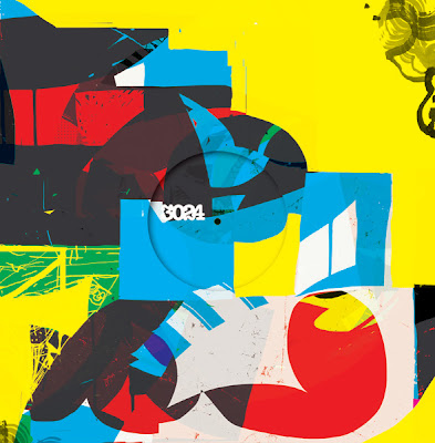
Three years since the closure of the Skull Disco logo and Shackleton has issued a lavish new package via his Woe to the Septic Heart label. Long-delayed, it incorporates three 'Drawbar Organ' EPs plus the Music for the Quiet Hour album that are on sale as a box set and also individually. The packaging utilises the unmistakable illustrations of Shackleton collaborator Zeke Clough although, unlike earlier releases that may have been a bit too close to the morbid imagery of death metal, this now appears to involve some more refined (yet still psychedelic) Robert Crumb-like penmanship.


20 April 2012

Keysound Recordings artwork

Link: Fabric blog

Martin 'Blackdown' Clark has posted an interesting overview of the visual aesthetic associated with, his label, Keysound Recordings. You'll find it on the Fabric blog via the link above. Keysound also hosts Room 3 at Fabric tonight - complete with sets from LHF, Dusk & Blackdown, LV, Sully, Logos and Vibezin.


10 April 2012

Jeroen Erosie interview at Dummy

Link: Jeroen Erosie interview

“Doing the artwork for a wide range of producers is a nice way of looking for this Gesamtkunstwerk approach. In the end, all of this is concentrated on this plastic disc with a piece of cardboard around it."

21 August 2011

Raffertie - 'Visual Acuity EP'

Released by Ninja Tune is Raffertie's 'Visual Acuity EP' with its sleeve photography courtesy of Meg Sharp. There might be a bit of a link with the Warp 10 artwork of yesteryear through that rather mundane architecture and it's purple-ish tones. The simplicity of the 'V' and 'A' of the title - that's reduced to some nicely balanced geometry - also stands out as quite lovely.

Mmmmm, triangles.


12 January 2011

14 Tracks from Planet Mu

Link: Ben Curzon
Link: 14 Tracks From Planet Mu

The new 14 Tracks from Planet Mu compilation features photography from Hilary Walker with design by Ben Curzon. The latter also devised that explosive motif that has graced the label's single releases and, previous collection, The Mu School: a really striking identity that has unified disparate releases from a roster of highly individual music makers.

As he puts it:

Planet Mu Records required an identifiable and expandable design system for an indefinitely numbered release schedule series of 12” singles. The design also needed to be simple and iconic to work equally effectively as small thumbnail images on digital download stores such as their own webstore at www.planet.mu and Bleep.com. A simple flash-like motif was created to display the key information of each release (Artist, Title, catalogue number and RPM). The structure remains identical, with colour changes and photography identifying each release...

The flash motif became so synonymous and immediately recognisable as part of the brand, it was applied to T-shirts, embroidered onto hooded tops, record bags and printed turntable slipmats.


8 January 2011

Doldrums

I've been an admirer of Will Bankhead's work since he was paired up with Ben Drury to produce visual work for Mo Wax. More recently I've been impressed with his solo-created sleeves for Pariah and Honest Jons.

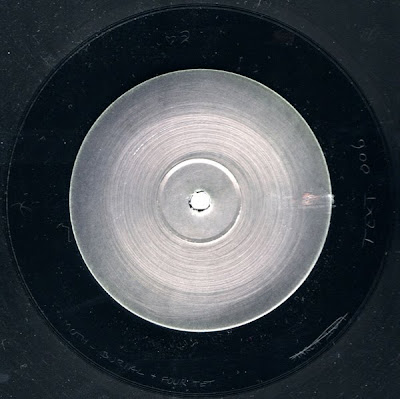
Now there are his designs for Joy Orbison's Doldrums label which might be ignored due to the low key look but, for me, that's what makes them so appealing. Admittedly, I love the whole utilitarian approach often involved with underground club records and the hand-stamped information continues that tradition. The minimal text, while also nice from an aesthetic point of view, reflects the whole upfront and non-mainstream aspects usually associated with 'the white label'. Evidently, it's a label that knows its market.