Showing posts with label Type. Show all posts

6 February 2013

Dinos Chapman - Luftbobler design by FUEL

Link: Fuel Design
Link: The Vinyl Factory 

Limited Edition details:
  • Four plate copper etching by Dinos Chapman, hand coloured on 300gsm Somerset Velvet soft white paper
  • Five colour screen printed artwork across four panels of cloth-bound bespoke board
  • Two 180-gram heavyweight hand etched records, containing the album's 13 tracks, pressed on the EMI 1400 in Hayes, Middlesex
  • Limited to 300 copies worldwide, each hand signed and numbered by the artist
  • One in every 10 copies contains an exclusive bonus track, pressed on an additional one-sided 12"
  • Mastered for vinyl by Noel Summerville at 3345 Mastering
  • Music written and produced by Dinos Chapman
  • Original etching by Dinos Chapman
  • Design by FUEL

One in every 10 copies also contains an additional one-sided 12" vinyl pressing of an exclusive bonus track, which will never be subsequently released on any format.

This limited edition is available to pre-order now. The Vinyl Factory will release 'Luftbobler' on gatefold vinyl, CD and digital formats on 25 February 2013. An accompanying, site-specific audio-visual installation will take place at The Vinyl Factory in Soho, London from 28 February to 3 March 2013.

Pricing:
  • The first 100 copies of this edition will be priced at £200
  • The next 100 copies of this edition will be priced at £250
  • The last 100 copies of this edition will be priced at £300


28 August 2012

Marc Romboy and Ken Ishii - 'Taiyo' artwork by Hort

Link: Hort 
Link: Systematic Recordings

It may signify a collaboration between two techno heavyweights, but Hort's artwork for Marc Romboy and Ken Ishii avoids all the machine-based visual cliches in favour of something more sensual. The release, on Systematic Recordings, comes with a poster/print that also offsets a stark yellow and black text area with more detailed black and white photography.


26 July 2012

Daphni - JIAOLONG artwork by Jane Eastlight

Link: Jane Eastlight
Link: Caribou

Ever enticing, Dan Snaith now moves on from being known as Manitoba and, more recently, as Caribou to air his Daphni guise for a proper long-player. Coming on double vinyl, CD and digital in October, JIAOLONG demonstrates his dancefloor leanings and features visuals from Jane Eastlight.

After also putting together a video for 'Ye Ye' (the track Snaith submitted for his split single with Four Tet), Eastlight's been developing a hypnotic concept seemingly based around lighting effects and repetition: an apt direction for what is one of this year's most anticipated club-oriented albums.


21 June 2012

Jacques Greene - 'Prism' by Jeroen Erosie

Link: Jeroen Erosie 
Link: 3024
Link: Dummy interview

Release 019 on the 3024 label comes from, Canadian producer, Jacques Greene. The artwork is again courtesy of, label co-owner, Jeroen Erosie and continues the specific house style that he's developed through sleeves for the likes of Jon Convex, Mosca, Julio Bashmore and Redshape. As he revealed in an interview with Dummy magazine, he uses the final layer of the previous release for each new piece and has subsequently developed an interesting 3024 continuum within the complex patterns. The latest also appears to have brought in some letter forms with assumedly what is a 'J' and 'G' to correspond with the Greene's intials. The single is out July.


28 April 2012

Hampshire University Records releases by Julian Montague

Link: Montague Projects

A collection of faux record covers imagined as listening materials for a character within Secondary Occupants: an exhibition by, artist, Julian Montague. In addition to his book and poster designs, each audio item picks up on some of the niche interests of the described collector whilst, in the case of the featured field recordings/Library Music offerings, inadvertently highlights the demand for this type of vintage esoterica.


27 March 2012

Smallville artwork by Stefan Marx

Link: Smallville Records
Link: Stefan Marx

With a style that can touch on both demented scrawls of David Shrigley and the cute naivety of Mr Scruff, Stefan Marx has defined an irreverent aesthetic for Hamburg's Smallville Records. This might be seen as betraying some of the serious (and seriously good) music that both the Smallville label and record store purvey, but then maybe that's the point. There are arguably enough pious techno-oriented outlets typified by impersonal and often minimal sci-fi graphics. So maybe this approach highlights that human touch.


29 November 2011

YCN/Warp Records design by Oli Marsh

Link: Oli Marsh

University of Salford MA Communication Design student Oli Marsh provided a winning response to YCN's Warp Records brief.

His concept was based around an ever-evolving album artwork that involved a release's title being die-cut into an outer sleeve before being customised by further complimentary imagery released via the web. Marsh chose to illustrate the idea by using Flying Lotus' Cosmogramma long-player with his inky example of text and image (top) having a nice relationship to his Droplet font (bottom). Other work of particular note by Marsh includes his text based on audio waveforms that he utilised on a poster design for the Sonar festival.


21 August 2011

Raffertie - 'Visual Acuity EP'

Released by Ninja Tune is Raffertie's 'Visual Acuity EP' with its sleeve photography courtesy of Meg Sharp. There might be a bit of a link with the Warp 10 artwork of yesteryear through that rather mundane architecture and it's purple-ish tones. The simplicity of the 'V' and 'A' of the title - that's reduced to some nicely balanced geometry - also stands out as quite lovely.

Mmmmm, triangles.


11 August 2011

Vulture Music artwork by Ben Roth

Link: Freisprung


Based in Berlin/Tel Aviv, Ben Roth has developed a lovely series of work for lauded French label Vulture Music. Monochromatic yet dream-like, it additionally seems to make full use of the form of the letter 'V' in a number of different ways. However, the cover of the Visitor release does remind me of the imagery for Darkstar's 'Aidy's Girl is a Computer' by Remote Location: what with the dominance of that retro-futuristic monolith. Still, while splitting his time between doing print and video work, I'm keen to see more from him.


7 August 2011

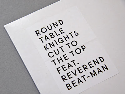
Round Table Knights - 'Cut to the Top' by Rosario Florio & Larissa Kasper

Link: September Industry
Link: Rosario Florio
Link: Larissa Kasper

Freshcuts Recordings
We Love It (Series)
Vinyl 12″

Record cover for “We Love It”. A series of exclusive releases pressed on vinyl by Freshcuts Recordings. Limited to 300 copies. This is the first 12″ of the series. The photography concept is based on an evolution of the picture. With every release an object or something else from the artist or the song will be placed in the picture. So the content grows until the last release. The finished series with all releases will be available in a wooden box.

Font: Apercu (customized)


12 April 2011

Releases by Jamie Woon

Coming through Polydor, the artwork from Burial-produced Brit School alumni Jamie Woon has taken influence from the title of, his album, Mirrorwriting. The latest in this type-oriented set comes as part of Record Store Day when Woon's 'Lady Luck' is made available as a limited edition picture disc.

It's out April 16th - alongside a whole raft of exclusives that include a remastered blue vinyl issue of the Art of Noise's influential 'Into Battle With...EP', a Bibio and Clark split single that prompts the first use of the classic purple Warp sleeve in four years, a new Mark Farrow-designed Deconstruction offering and a delicious Toddla T feat. Roisin Murphy 'Cherry Picking' 12".


1 February 2011

Ellen Allien - Dust Remixes by Pfadfinderei

In general, designers appear to have a bit of a problem with the generic CD jewel case: it's possibly the Comic Sans of music packaging. That may be why I like this fairly simple and unabashed BPitch Control release by Florian Sebald of Pfadfinderei: the Berlin collective that created a lot of artwork for the label [including that striking Modeselektor 'monkey' logo].

25 January 2011

Fenech-Soler work by Kate Moross

Maybe it's because it wasn't uploaded to Kate Moross' site or because the shops I'd frequented had decided not to stock, but the last batch of work for Fenech-Soler had passed me by. Odd really as I had been aware of the earlier - and less interesting - output by this electropop band.

Anyway what Moross has commendably managed to do here is retain the essence of the 1980s that more blatantly permeated their early visuals yet stayed true to her own passion for geometric shapes. The typography has an Art Deco revival feel but that, for me, only adds to that eighties aesthetic. Plus there's a lovely metallic sheen courtesy of Jane Stockdale's phototography.

I hate to say 'retro-futurism' again, but it is all a bit like Miami Vice in space.

Perhaps.


23 January 2011

Skinny Ships' 10 x 10

Link: Skinny Ships

Lists of records are great. However Richard 'Skinny Ships' Perez is a designer from San Francisco and he has compiled his top 10 albums of 2010 as a unique visual collection.

They're currently viewable on his Flickr photostream and fall somewhere between alternative cover art and (via the inclusion of release date, number of plays, etc) infographics. The Kanye West one - with the halftone on the painted text - is my personal favourite.


19 January 2011

Beck - Modern Guilt by Mario Hugo

Link: Mario Hugo

Here's some beautiful typography for Beck's Moden Guilt that actually turns out to be just one of six treatments that Mario Hugo pitched. All of his ideas were actually great. Yet none of them were used. The final artwork has also been pasted below and, while I happen to be more of a fan of Hugo's approach, I suppose you have to respect Beck Hansen's right to go with his own instincts. After all, he has been a great patron of good design throughout that recording career of his.

Let's just hope that Hugo gets to use those letter forms elsewhere.


17 January 2011

Häpna artwork

Link: Häpna

I like Swedish label Häpna's inclusion of hand written text - especially when it's in pencil. It recounts what Rick Myers did for some of the Lamb sleeves. Particularly the reverse of the 'Gorecki' digipack.


10 January 2011

Dot Dot Rock

Zoë Street Howe on the black art of ‘metal umlauts’


‘Metal umlauts’ echo the ‘devil horn’ rock salute, carry a menacing whiff of Gothic mystery – and make us look twice. Yes, heavy rockers love a good diacritical mark, and it appears that the gratuitous umlaut, often presented in conjunction with dense blackletter script, has been good, in turn, to them. There is even a metal band called Umlaut. (Yet their name bears no dots. See what they did there?)...


Full article link
: Eye
Below: Motörhead logo by Phil Smee & Joe Petagno


9 September 2010

Immortal Melodies (dead)

As part of my own experiments, I got around to lasering some items today. I realised that the machinery's cutting funtion is different to the etching function in as much as the software traces the basic outlines of the jpeg. This also offered the option of altering the contours of the outlines so I further simplified the serif stencil-friendly typeface I had used. It ended up bolder and more 'custom'. You can see how it was used on the 'Immortal Melodies' 7" that finally had its date with destiny. The message reads "WHAT GOES AROUND".