Showing posts with label Typography. Show all posts

20 April 2015

Jlin - Dark Energy artwork by Spencer Shakespeare and Fabian Harb

Link: Planet Mu
Link: Knives
Link: Dinamo

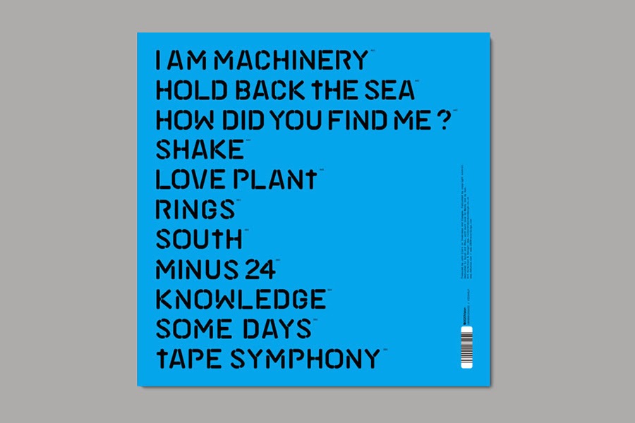
With A&R and art direction by Spencer Shakespeare's and Jamie 'Kuedo' Teasdale's KNIVES imprint/creative agency (although unleashed via the always forward-thinking Planet Mu), Jlin's Dark Energy long-player takes both footwork and record artwork seriously. The finished package also benefits from sizeable input from Fabian Harb of, type foundry, Dinamo and effectively will whet appetites for what's to come from a new type of collaborative practice. 

As Teasdale notes in an interview with FACT: 
"From the outset, we both knew that the label had to offer something individual in terms of validating its existence. Due to our collective interests and backgrounds, we also knew that this would somehow encompass visual art, graphic design and a collaborative working process."


3 December 2013

Debukas - I Am Machinery by Richard Robinson

Link: Richard Robinson
Link: Debukas
Link: 2020Vision

Available now is the Debukas album I Am Machinery on 2020 Vision. As already featured in full on the wonderful Collate, it incorporates a great custom typeface by the masterful Richard Robinson (that seemingly follows on rather nicely from his contemporary stencil-based re-design for Dummy).


6 February 2013

DJ Rashad - 'Rollin' artwork by Optigram

Link: Optigram 
Link: Alex Trochut
Link: Hyperdub

Another sleeve from Manuel Sepulveda of Optigram for the Hyperdub label. This time it's a visualisation for an upcoming four track EP by DJ Rashad: a name synonymous with Chicago's footwork sound. Not that this is completely new territory for Sepulveda (he previously designed an album cover for, scene stalwart, Traxman on Planet Mu) but it is representative of Hyperdub's continued diversification.

This one sees the designer creating the sort of dark textures that typified Ikonika's 2010 album while also making use of a bold typeface created by Alex Trochut.


2 February 2013

Fort Romeau - 'SW9' artwork by Michael Cina

Link: Michael Cina
Link: John Klukas
Link: Ghostly

More beautiful Ghostly/Spectral work from Michael Cina that picks up from the painterly figurative style of his previous Matthew Dear sleeve. Only this time (for the 100% Silk-affiliated Fort Romeau) the paint adds a gauzy texture to a photograph of a woman by John Klukas with further veiling of the image via a more rigid graphic overlay. Cina pairs this with some sophisticated and carefully arranged type on the reverse. Out 11th March.


29 June 2012

Gatekeeper - Exo artwork, environment and font by Tabor Robak

Link: Tabor Robak
Link: Hippos In Tanks

Following acclaimed releases from the likes of Grimes, James Ferraro and Laurel Halo, the always intriguing Hippos In Tanks label now readies the debut long-player from, New York-based duo, Gatekeeper.

Exo, as it's titled, is accompanied by collaborative visual work from Tabor Robak that extends further from a simple packshot to include a custom-made downloadable font and an immersive, first person gaming environment. The whole utopian sci-fi/techno-fetishism aesthetic might work for many [personally, I prefer the more organic and abstract digital fantasies of artists like Konx-om-Pax in addition to work including Robak's own 'Rocks' experiments], but the idea of providing something far more innovative than a bundle of MP3s with a thumbnail is always welcome. Especially given that this is genuinely a truly exploratory, multi-sensory project. Out July 17th.


13 June 2012

Matthew Dear - Beams by Michael Cina

Link: Michael Cina
Link: Ghostly International
Link: Matthew Dear

Following the dark visual and sonic aesthetic associated with Matthew Dear's Black City long-player, Beams - his upcoming album - has a very different feel. There's a more optimistic approach here that, in terms of both sight and sound, was evident on his 'Headcage EP'. And it has continued through, catchy new single, 'Her Fantasy'.

For the artwork, Michael Cina's use of colour is clearly suggestive of the new direction, but texturally - lacking the smokiness and grittiness of Black City - it also feels more joyful (whether that's applied to his abstract or more figurative imagery). Cina says:

"The Beams project has been the most ambitious music packaging project that I have worked on to date. It started in November of 2011 and ended in May of 2012. The full scope involves almost 100 paintings, two of the paintings being 20 feet long, flying to NYC to be filmed painting a six foot portrait, another portrait that took two months to paint, a custom typeface, and countless designs. There will be four singles to come off this record as well, each requiring new pieces as well."


29 November 2011

YCN/Warp Records design by Oli Marsh

Link: Oli Marsh

University of Salford MA Communication Design student Oli Marsh provided a winning response to YCN's Warp Records brief.

His concept was based around an ever-evolving album artwork that involved a release's title being die-cut into an outer sleeve before being customised by further complimentary imagery released via the web. Marsh chose to illustrate the idea by using Flying Lotus' Cosmogramma long-player with his inky example of text and image (top) having a nice relationship to his Droplet font (bottom). Other work of particular note by Marsh includes his text based on audio waveforms that he utilised on a poster design for the Sonar festival.


2 June 2011

The Vinyl Factory by Tom Darracott

Link: Tom Darracott
Link: The Vinyl Factory

Tom Darracott received a lot of attention for the design/illustration work put together for, London club, Fabric. He also devised the art direction for Mark Ronson's Version album and its successful campaign. Plus there's also the identity work for the Vinyl Factory that is featured below [a company, by the way, whose own lovingly crafted output has already appeared in this blog quite a few times).


25 April 2011

Josef Albers for Command Records

Bauhaus-associated artist, educator, typographer, poet and writer Josef Albers also created a number of album sleeves for Command Records between 1959 and 1961. They include these beautiful examples:


25 January 2011

Fenech-Soler work by Kate Moross

Maybe it's because it wasn't uploaded to Kate Moross' site or because the shops I'd frequented had decided not to stock, but the last batch of work for Fenech-Soler had passed me by. Odd really as I had been aware of the earlier - and less interesting - output by this electropop band.

Anyway what Moross has commendably managed to do here is retain the essence of the 1980s that more blatantly permeated their early visuals yet stayed true to her own passion for geometric shapes. The typography has an Art Deco revival feel but that, for me, only adds to that eighties aesthetic. Plus there's a lovely metallic sheen courtesy of Jane Stockdale's phototography.

I hate to say 'retro-futurism' again, but it is all a bit like Miami Vice in space.

Perhaps.


John Foxx and The Maths - Interplay by Jonathan Barnbrook

Typography demi-god Jonathan Barnbrook announced on Twitter that he was designing a cover for John Foxx and The Maths' Interplay album. Just seven minutes later he posted a link to it. Is this some kind of record?

Anyway, it reminded me of Fischerspooner's Odyssey: a sleeve I had previously admired for its pharmaceutical company logo-like simplicity.


23 January 2011

Skinny Ships' 10 x 10

Link: Skinny Ships

Lists of records are great. However Richard 'Skinny Ships' Perez is a designer from San Francisco and he has compiled his top 10 albums of 2010 as a unique visual collection.

They're currently viewable on his Flickr photostream and fall somewhere between alternative cover art and (via the inclusion of release date, number of plays, etc) infographics. The Kanye West one - with the halftone on the painted text - is my personal favourite.


19 January 2011

Beck - Modern Guilt by Mario Hugo

Link: Mario Hugo

Here's some beautiful typography for Beck's Moden Guilt that actually turns out to be just one of six treatments that Mario Hugo pitched. All of his ideas were actually great. Yet none of them were used. The final artwork has also been pasted below and, while I happen to be more of a fan of Hugo's approach, I suppose you have to respect Beck Hansen's right to go with his own instincts. After all, he has been a great patron of good design throughout that recording career of his.

Let's just hope that Hugo gets to use those letter forms elsewhere.