Link: Jeroen Erosie
Link: 3024world
Link: The Designers Republic
Link: Autechre
Co-running the brilliant 3024 label with Martyn, Jeroen Erosie also maintains a career as a lauded street artist. Recently bringing the two together through a series of beautifully chaotic collage-like sleeves for the likes of Mosca, Redshape, Julio Bashmore, Addison Groove and Jon Convex, he reveals that his own favourite record cover is the minimal/maximal solution by The Designers Republic for Autechre's Tri Repetae.
"Plain from the outside," he observes, "visually linked to the music on the inside: it made a big impression when I first saw and heard this. And still does. It seems it all came from the same weird planet, so consistent and subtle."
Showing posts with label Minimal. Show all posts
Showing posts with label Minimal. Show all posts
3 April 2012
2 July 2011
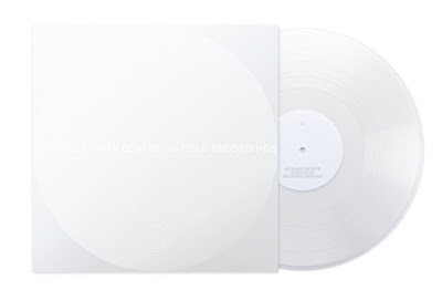
Richard Eigner - Denoising Field Recordings sleeve by Hans Renzler
Link: Wald Entertainment
Released: 2009
Released: 2009
Denoising Field Recordings documents an early attempt at using denoising-techniques in a creative and compositional manner. Instead of utilising noise-reduction-algorithms for their intended purpose (the restoration of damaged audio signals), these processes are applied to various field recordings of trains, streets, swimming halls and public transport. Due to the fact that these recordings consist entirely of noises this operation transforms the originals into an uncanny hybrid of newly introduced processing artefacts, occasional silence and sporadically audible traces of the original field recordings. What kind of sound-aesthetics can emerge while denoising field recordings? Which audible parameters are able to resist this »audio-erasement-process«? How are these traces comparable to the visual remanences of Robert Rauschenberg’s erasure of a de Kooning drawing?
Denoising Field Recordings is released as a limited edition of see-through 12" vinyl with an intruiging white-on-white cover [printed exclusively with varnish] designed by Hans Renzler.
8 January 2011
Doldrums
I've been an admirer of Will Bankhead's work since he was paired up with Ben Drury to produce visual work for Mo Wax. More recently I've been impressed with his solo-created sleeves for Pariah and Honest Jons.
Now there are his designs for Joy Orbison's Doldrums label which might be ignored due to the low key look but, for me, that's what makes them so appealing. Admittedly, I love the whole utilitarian approach often involved with underground club records and the hand-stamped information continues that tradition. The minimal text, while also nice from an aesthetic point of view, reflects the whole upfront and non-mainstream aspects usually associated with 'the white label'. Evidently, it's a label that knows its market.
Now there are his designs for Joy Orbison's Doldrums label which might be ignored due to the low key look but, for me, that's what makes them so appealing. Admittedly, I love the whole utilitarian approach often involved with underground club records and the hand-stamped information continues that tradition. The minimal text, while also nice from an aesthetic point of view, reflects the whole upfront and non-mainstream aspects usually associated with 'the white label'. Evidently, it's a label that knows its market.
Subscribe to:
Posts (Atom)


