10 August 2010

That's Cool But Can You Make It More Sh*t

DFA Records' art director Michael Vadino has seen much of his work displayed as part of That's Cool But Can You Make It A More Sh*t: a retrospective of the label's visual material in Australia. (The exhibition will eventually be travelling to London and, home city, New York.) It featured a selection of material including cover art, flyers, drawings, posters, photos and other promotional material. [You can see Jason Munn's LCD Soundsystem poster also displayed in the pic below.]

At a time when many are discussing the divorcing of music from its artwork as equating with its demise in the digital era, we have events like this that do much the same while actually championing the visual material.

There's an interview with Vadino at www.thevine.com.


Warp20 box set

I mentioned the supposed ubiquity of particular designers to releases by specific labels earlier when noting what Vaughan Oliver is to 4AD and Peter Saville is to Factory. Last year's Warp20 artwork is a bit of an anomaly as it wasn't created by the intrinsically linked Ian Anderson of The Designers Republic. Instead YES did a very fine job of packaging a selection of must-have material from the seminal Warp Records. Everything from those esoteric images to the splashes of purple to the often subtle introduction of text is in keeping with representations throughout the label's 20 year history. [The inclusion of 'locked grooves' on the vinyl also has personal appeal as it is about using a format for its potential capabilities rather than just being a nod to sentimentality.]

While these editions sold out quickly, the mobius band-based photographic work (by Dan Holdsworth) has since been released as four collectible prints in an edition of 100. Price £65 each or £250 for the set. Music not included.


Hard Format

"It seems like everybody’s talking about the end of physical music
media. Who knows whether they’re right or not, but Hard Format is a
little place we’ve set up to celebrate our love of brilliant
music-related design. That means we’re going to focus on records, CDs,
cassettes and their like. However, Hard Format isn’t intended to become
a dusty museum devoted exclusively to past glories, though there’ll
certainly be some of that, we also want to highlight the brilliant new
design work being produced right now. In fact, we’re not setting
ourselves up to supply a canon of classic design - this is a place
where we record stuff we like, if you want yet another reproduction of
Sergeant Pepper’s Lonely Hearts Club Band there are enough ‘Greatest
album covers of all time’ books out there already."

Hard Format is a collection and study of the design and art of physical music media and it's packaging. Not just another collection of album covers on the Internet, Hard Format embodies a love for the music-related design of CDs, cassettes and vinyl.

I specifically like the material that moves away from the supposed restrictions of the traditional format but then I can also recount how some of my own music purchases - such as Mo Wax and Spiritualized releases - would be a little annoying as they wouldn't be easily stored due to their increased size. Shop-bought CD racks, for example, never had the capacity for 'deluxe' editions.


9 August 2010

Daft Punk's Daft Card

I previously wrote an essay about Daft Punk's use of visual forms. Specifically it dealt with the representation of man as a robot. And I do really like how the duo creates high-profile work while playing around with notions of anonymity: sometimes I enjoy how it works conceptually more than what they do musically.

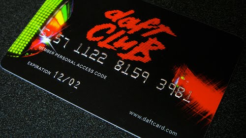
While the French twosome has consistently dabbled outside of traditional music formats with everything from animated films to coffee tables via a Gap commercial, I was always impressed by the 'Daft Card' that came with copies of, second album, Discovery. This gained entry to 'Daft Club': an online resource that allowed for the download of bonus material including extra tracks and remixes. It is telling that this was devised in 2001 as, the first available track, 'Ouverture' begins with the stupid electronic noise of a dial-up connection and remains a testament to the technology of the time [this content has since been released seperately as 'Daft Club', by the way].

The use of the credit card as a physical form also lends itself to discussion regarding the commodification of music yet - let's face it - it was still a handy little object that also fitted neatly into your wallet.

Pop Matters by Nikolay Saveliev

Viral-Promotional Record Sleeves, 2007

Vinyl record sleeves with 2-sided insert featuring faux-academic material on pop music and the state of the record industry, seeded with promotional material for indie radio stations. Sponsored by Brown Student Radio. Snuck onto used and new record store shelves. 140 copies in total. More at www.nikolaysaveliev.com


The 'totem'

When I blogged the Matthew Dear 'Totem' format earlier, I didn't immediately make the connection between it and the totems used in the film Inception. The latter are devices that the characters use to help determine the difference between dream states and consciousness and include the pictured spinning top that behaves in a specific way that helps clarify what is and isn't reality. [I'm trying not to post anything that might be considered a 'spoiler'.]

This and Dear's totem perhaps generates a whole dialogue about how we attach meaning to objects. Getting deeper into that discussion, it might be off-putting should it verge on the quasi-religious yet ultimately we are actually talking about a question of faith. Belief allows for the perception of items as having deeper symbolic meaning: most often associated with decorative artefacts with examples dating back to the Stone Age. Yet functional products can take on significance outside of their primary purpose. The research that I've undertaken over the past couple of weeks increasingly supports the idea that music formats do this: transmitting information aside from the audio and visual material that they carry. This cultural theory aspect is possibly something I need to consider further to refine my rationale. Maybe while noting its relationship to Benjamin's "aura" and Baudrillard's "simulacrum".

Inception

Laurie Anderson quote

"Technology is the campfire around which we tell our stories."


[Thanks to Tash for forwarding this.]

Kitsune Noir Mixcasts

Art and design blog Kitsune Noir has been offering its compiled music 'Mixcasts' for a while now. Each comes with artwork. Yet as a digital download, it doesn't actually require any more than a text track list but it could be argued that the imagery allows the opportunity to build on the theme of the compilation itself with something substantially more evocative. However, I would suggest that the proportions and layout needn't follow the same template of a CD version given the freedom of a non-physical release. These, while beautiful, do seem to conform to some agreed idea about what a tangible music format should be.


Gig posters by Telegramme

More examples of the effort that is being put into devising eye-catching gig posters. These are by the formerly Cornwall and Bristol but now London-based duo that operates as Telegramme. [Other exponents of quality gig posters that I should reference quickly are Sonnenzimmer's Nick Butcher and Nadine Nakanishi plus the very influential Jay Ryan. There are also hundreds of lesser known practitioners featured at www.gigposters.com]

I particularly like the way that Telegramme have managed to focus on location for their Arctic Monkeys series: taking design inspiration from where the gig is set to take place. Although, for me, the colour use and addition of intricate pattern does recount some of Shepard Fairey's output. Style-wise, I'm more attracted by the Mum piece that boasts the kind of tesselated structure that has also drawn me to some of the work by Siggi Eggertsson and Andy Gilmore.


Laura Veirs - July Flame LP

The latest album by singer-songwriter Laura Veirs features some bewitching illustrations by Portland's Carson Ellis. Yet it's the embedded video that demonstrates the real fetishism that meets music formats with the arrival of the vinyl edition prompting excitement. Everything from the proclaimed weight of the disc through to the discussion of the quality of stock highlights the value placed on physical formats. It is also mentioned how the purchase also includes a "download voucher" so that owners can also access the digital version.

8 August 2010

Pixies - Minotaur

Tash alerted me to last year's deluxe Pixies box set overseen by Jeff Anderson and featuring some new work by amazing 4AD visionary Vaughan Oliver and photography by Simon Larbalestier. One thing that strikes me about this project was how a process eventually led them to Oliver when I would have thought this would have been an obvious route if not completely inevitable. Certainly, I don't think of anyone else when I recount artwork for Pixies releases and the 'surprise' regarding his involvement is akin to that where someone decides that Peter Saville might be the right man to knock-up some New Order artwork.

Anyway, some info:

Five classic 4AD releases from Pixies are going to be reissued as both Limited Edition and Deluxe Edition collector's sets entitled Minotaur. Spearheaded by Jeff Anderson, founder of A+R (Artist in Residence), who has put together expansive and eye-catching versions of releases by Nine Inch Nails, Beck and Sigur Ros - Minotaur will be available for pre-order at www.ainr.com beginning Monday, June 15, 2009. The Minotaur Deluxe Edition will retail for $175, while the Minotaur Limited Edition will be priced at $450.

The Deluxe Edition will include all five Pixies studio albums - Come On Pilgrim (1987), Surfer Rosa (1988), Doolittle (1989), Bossanova (1990), and Trompe le Monde (1991) - on 24k layered CD and Blu-ray (five discs total), with reinterpreted artwork by Vaughan Oliver, the graphic designer who created all of the artwork that accompanied the Pixies' studio albums. Also included in the Deluxe Edition will be a DVD of a Pixies 1991 performance at the Brixton Academy in London, the group's videos, possible live tracks, and a 54-page book, all housed in a custom slipcase. The Minotaur Limited Edition version will include everything in the Deluxe Edition, as well as all five albums on 180 gram vinyl, a Giclee print of Oliver's artwork, and a 72-page hardcover book, all housed in an oversized custom clamshell cover.

Anderson explained the idea behind the set. "As a Pixies fan, I asked myself, 'How can we re-release this without making this just another box set?' I think we've all been down that road where you've purchased a box set and have been disappointed by only getting a few bonus tracks and a few extra photos. With the Pixies, because they remain such a contemporary band and their sound is still so relevant today, we wanted to re-introduce them to their fans, giving them something that they would truly appreciate and cherish. And also, how can we introduce the band to new fans? What soon followed was the idea of Vaughan Oliver."

Oliver - who was the resident album designer for 4AD - explains how he assembled the now instantly-recognizable album covers for the band. "My starting point would always be the music, reading the lyrics, talking with the band - what their preferences were, in film and painting. With the Pixies, it was work that was always close to my heart and my own personal aesthetic - the images that Charles [aka Black Francis] painted with his lyrics really struck a chord. His work is full of fantastic imagery that always appealed to me, and those were ideas I was trying to reflect with the packaging."

After discussing the project with Anderson, Oliver came up with an intriguing idea. "I said, 'That was then, this is now. Why don't we do a whole new body of work? It's all born of the same lyrics and albums - it would be evolving the ideas we had in the original packages.' I worked with the same photographer who I worked with back then, Simon Larbalestier. If there were a 'fifth Pixie,' it would have been Simon - his work so suited what they were doing. Simon's gone out and shot a whole new body of work. He was a bit panicked at first, he said, 'The old sleeves - with the topless Spanish dancer, the red planet - have become iconic.' I said to Simon, 'Don't be scared. You're 20 years on, you're a better photographer. Let's take all those same things and do a new body of work.' He shot some amazing images that I think surpass what we did first time around."

An occasional design tutor at the University of the Creative Arts in Epsom [Surrey, U.K.] whilst still running his v23 design business, Oliver called upon his students for some input for the Pixies set. "I selected a team of students under my direction to work with the titles in the track listing, in a three dimensional way. Cutting the track listing out of cards, shining light through it, making the track titles from nails - all very organic. We're using the type as 'image.' There's a link when you look at them visually with the images that I'm putting next to them in the book."

Upon seeing the gorgeous packaging and effort that has gone into both the Deluxe and Limited Editions of Minotaur, Pixies fans worldwide will get a chance to experience the Pixies in a whole new manner, thanks to Anderson, Oliver, and Larbalestier. "We design some interesting and innovative packages," adds Anderson. "We're not inexpensive, but I think there are still people out there who don't mind paying for great quality."