29 November 2011

YCN/Warp Records design by Oli Marsh

Link: Oli Marsh

University of Salford MA Communication Design student Oli Marsh provided a winning response to YCN's Warp Records brief.

His concept was based around an ever-evolving album artwork that involved a release's title being die-cut into an outer sleeve before being customised by further complimentary imagery released via the web. Marsh chose to illustrate the idea by using Flying Lotus' Cosmogramma long-player with his inky example of text and image (top) having a nice relationship to his Droplet font (bottom). Other work of particular note by Marsh includes his text based on audio waveforms that he utilised on a poster design for the Sonar festival.


26 November 2011

More work from Alex Jenkins

Link: Alex Jenkins' Tumblr
Link: Alex Jenkins' Twitter

I previously posted some artwork by designer Alex Jenkins and have since been sent some better quality images by the man himself - including a number of projects that I hadn't picked up on.

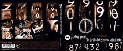
As in-house designer for XL Recordings, Jenkins produced a series of memorable sleeves for The Prodigy dating back to 'Firestarter'. His Tumblr documents some of this material alongside additional photography credits and the stories attached to their creation - including the un-used 'Kebab' cover for Fat of the Land that involved a £13,000-£14,000 shoot with the surplus doner meat finding its way into the stomachs of London customers. [Doubt the same fate was dealt to the crab that was used for the finished album.] Another meaty offering also came in the shape of his cleverly vacuum-packed 'salami' CD that featured a sample of tracks from XL's roster.

Anyway, it's a diverse collection that followed on from Jenkins' uni hand-in that consisted of his re-imagining of the packaging for Orbital's first album, and - as a single body of work - appears to be united by the employment of gritty textures. The most complete sets have to be the beautiful deteriorated and stained Breakbeat Era campaign (complete with budget-busting bookbinding materials) plus his collection of nocturnal urban imagery for The Streets (including that iconic Clipper lighter logo that knowingly taps into stoner culture). The latter was developed for 679 Records as a freelance project while Jenkins' other non-XL commissions have come from the UK garage-oriented Locked On label, the progressive house-biased Y2K imprint and Freskanova Records' The Freestylers. However, what's not featured below is a succession of Jenkins' identity/branding assignments for other industries that only further demonstrate his ability to shift from fairly niche products to design for high-profile clients.




24 November 2011

Mute Audio Documents by Adrian Shaughnessy/This Is Real Art

Link: Shaugnessy Works
Link: This Is Real Art

Re-visit of an Adrian Shaughnessy design for a retrospective of the entire output of Mute Records that catalogues distinct periods in the history of the company as documents.

It's posted here as a reminder that Adrian Shaughnessy also has a publishing company, Unit Editions. The latter has a week left on its sale with 50% off selected items including the Supergraphics and Studio Culture books and a number of Wim Crouwel posters.

Link: Unit Editions


19 November 2011

Kosmik Kommando - Analogue Android limited edition box set

Link: Machine Codes

With a run of just seven box sets, Kosmik Kommando's Analogue Android album is a proper limited edition. The small number demonstrates how much time and effort has gone into each one with its series of hand-painted labels. The standard vinyl is also a bespoke offering with an airbrushed cover plate and vinyl containing individual messages.

[Thanks to Marc Bessant for pointing this out on Twitter.]


10 November 2011

Artwork by Optigram

Link: Optigram

Optigram is the design company operated by Manuel Sepulveda whose commissions include sleeves for Steve 'Kode9' Goodman's Hyperdub plus the similarly lauded Warp, Planet Mu and Citinite labels.

Some of the work involves tessellated shapes akin to Andy Gilmore's art whilst a few of Sepulveda's Terror Danjah sleeves have a 1980's-ish retro-futuristic feel complete with the kind of geometric monoliths not a million miles away from La Boca's work for The Emperor Machine. Much of the Optigram output is playful in its use of colour, but I'm also liking these moodier monochromatic offerings including the imagery that adorned Ikonika's album.