26 July 2010

Jamboxx for the iPad

A great find by Amy [thanks again!] in the iTunes App store. Developed by Butler, Shine, Stern & Partners, LLC "Jamboxx takes you back to the days of mixtapes and boom boxes with an 80s-inspired interface that'll get you nodding your head to the beat in no time".


Dieter Rams' Ten Commandments

I mentioned Dieter Rams in passing previously as I loved the proportions of the radios he designed for Braun. Anyway, I just came across his ten most important principles for good design and they still have resonance. The stripped-down 'less is more' directive and the reaction against the 'fashionable' might not be relevant to every project/every end user, but in fulfilling his other objectives ('long-lasting', for example), he's certainly on to something. As mentioned endlessly on the web, you only need look at Jonathan Ive's products for Apple to witness his influence. Anyway, those ten commandments:


Good design is innovative.
The possibilities for innovation are not, by any means, exhausted. Technological development is always offering new opportunities for innovative design. But innovative design always develops in tandem with innovative technology, and can never be an end in itself.

Good design makes a product useful.
A product is bought to be used. It has to satisfy certain criteria, not only functional, but also psychological and aesthetic. Good design emphasises the usefulness of a product whilst disregarding anything that could possibly detract from it.

Good design is aesthetic.
The aesthetic quality of a product is integral to its usefulness because products we use every day affect our person and our well-being. But only well-executed objects can be beautiful.

Good design makes a product understandable.
It clarifies the product’s structure. Better still, it can make the product talk. At best, it is self-explanatory.

Good design is unobtrusive.
Products fulfilling a purpose are like tools. They are neither decorative objects nor works of art. Their design should therefore be both neutral and restrained, to leave room for the user’s self-expression.

Good design is honest.
It does not make a product more innovative, powerful or valuable than it really is. It does not attempt to manipulate the consumer with promises that cannot be kept.

Good design is long-lasting.
It avoids being fashionable and therefore never appears antiquated. Unlike fashionable design, it lasts many years – even in today’s throwaway society.

Good design is thorough down to the last detail.
Nothing must be arbitrary or left to chance. Care and accuracy in the design process show respect towards the consumer.

Good design is environmentally friendly.
Design makes an important contribution to the preservation of the environment. It conserves resources and minimises physical and visual pollution throughout the lifecycle of the product.

Good design is as little design as possible.
Less, but better – because it concentrates on the essential aspects, and the products are not burdened with non-essentials.
Back to purity, back to simplicity.


The Visual Mixtape by Noa Emberson

As seen on Emberson's site (www.joystain.com) but given decent coverage on, very nice blog, Forgotten Hopes.

This is a self-initiated project where Emberson creates posters for his favourite albums. The series consists of 25 individual pieces and I really like the way that they work as a set. They are are also very information heavy yet still manage to be really beautiful. However, I can't see their pastoral aesthetic working for more obviously "urban" genres. Unless, of course, its to play off those opposites.


22 July 2010

9 July 2010

Artwork by Alex Jenkins

Link: Alex Jenkins

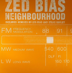
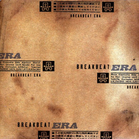
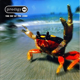
Alex Jenkins is predominently known for his work as inhouse designer at XL Recordings. His most recognised sleeve is The Prodigy's Fat of the Land but he has also created work for one-off singles. His portfolio includes UK garage-oriented material for sub-label Locked On and, artist, The Streets while, additionally, he devised the look of the records for the drum & bass-propelled Jonny L and Breakbeat Era plus a featured release by The Freestylers.

What I like about this work is the idea of a colour-coded, perhaps collectible set (as with the Locked On releases) and the feeling of a 'used' product (again, with Locked On and also evident in the Breakbeat Era series). There's a utilitarian aesthetic from both the stencil text and the bold sans serif fonts that I think is also important in terms of continuing a lineage of underground club records as functional items. However, they are - as with some of the other images that I'll be referencing - of a particular age while very much in tune with the scenes that they represented.


8 July 2010

Inner Sleeve


As I'm pillaging The Wire's content, I might as well reference the excellent section known as Inner Sleeve. This is an ever growing archive featuring an individual (musician, visual artist, designer, label owner, writer, etc) choosing and discussing his or her favourite piece of music related design. An online selection is to be found here.

The above is an especially nice example featuring a Finnish techno release by Ø : a.k.a. Mika Vainio who later went on to commission some beautiful packaging solutions when working as part of, experimental trio, Pan(a)sonic.

6 July 2010

MJ Cole campaign - art direction by Michael Williams

The MJ Cole artwork that marked the producer's move from underground work to major record company in 1999 appears to be a comment on the label-conscious times. But we can see that it also identifies Cole as a 'brand'. The placing of the former hardcore/drum & bass name in the scene's heirarchy also becomes closely linked to the kind of style-oriented images: along with references to Cole's classical training and smooth, melodic output, we find reviewers discussing him as "dapper" and "classy". This is often exaggerated by defining an opposing approach to other names that had emerged within the UK garage scene and the likes of So Solid Crew are addressed as the uncouth alternative to his supposedly more well dressed and assumedly polite direction. [There may be concerns that some of these assertions may be racially motivated and, despite the music within the hardcore continuum being a product of the African diaspora, some critics have commented on major labels cherry picking white artists from within these scenes to achieve crossover success.]

The art direction of Michael Williams does, of course, play with the idea of sophisticated, glossy imagery. The designer bag - indicative of aspirational consumerism - burns. The Champagne bottle spills a thick toxic slick while the chunky sports watch - more a status symbol than a time-piece - is charred. The turntable cartridge/stylus is the only item from the series that is undamaged and we might see its maintained perfection as indicating that this is the only kind of product fetishism that is relevant: that the delivery of the music is of more importance than the items solely associated with displaying wealth.

Or something.

5 July 2010

Todd Edwards - 'I Might Be'


Todd Edwards was hugely influential to the development of UK garage. Like fellow Americans Masters At Work, his skippy house rhythms were adopted by the scene here in the UK with special attention paid to his use of sampling. Edwards' approach was to clip elements of the vocal to create a staccato delivery: leaving traces of an actual song reduced to something akin to another, almost percussive instrument. His remix of St Germain's 'Alabama Blues' (1995) is identified as a major turning point within club music. (Edwards is also notable for his subsequent collaborations with Daft Punk.)


In March of this year he released 'I Might Be' through audio-visual label Scion A/V. The project and its remixes are testament to the existence and continued relevance of Reynolds' Hardcore Continuum with reworks coming from post-dubstep talent Joy Orbison and garage producer MJ Cole [who it should be noted started his recording career as tape operator for drum & bass label SOUR].

In terms of looking for more refined examples of visual referents for music within this point of the continuum, I'm noting the artwork that was created (top image). Unfortunately I can't find a designer credit but there is an additional video promoting the release below which furthers a concept of the esoteric/cosmic/kaleidoscopic meeting sophisticated typography.


4 July 2010

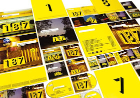
187 Lockdown artwork

While looking at some of the artwork that was used for UK garage releases, the designs for 187 Lockdown stood out. These were created by agency Form and the whole campaign really does not typify the output of the scene. This is likely to be due to the fact that we have a cutting-edge multi-disciplinary agency working on behalf of a major label. Elsewhere at this point (1997) there is more evidence of a localised, lo-fi approach with producers or labels turning to less established practitioners operating within (or at least on the fringes) of the genre. Often this means approaches that are affected by barely existent budgets and, in cases, this prompts what might be seen as 'amateurish' work. The latter observation isn't a slight, of course: in many cases a less slick approach would have had benefits (specifically in terms of maintaining a release's 'underground' credentials).

What I have noticed is a later split between the kinds of produced visuals as UK garage began to achieve even more mainstream success: we began to see very polished sleeves aimed at buyers of chart records in addition to the continued use of the 'house bag' or generic label sleeve. In some cases many labels would choose to maintain the latter for their supposedly DJ-oriented vinyl release while the more commercial CD format would have production values perhaps more closely associated with pop releases. Additionally there is evidence of an aspirational quality creeping into some of the visual material perhaps mirroring the popularity of designer brands within the scene. [In Discographies Gilbert and Pearson mark the return of 'dress up' door policies within this scene following the acid house's refusal of such restrictions. The elitism also affected social behaviour with the popularity of Champagne in some of London's garage clubs. There is more to say about all this - particularly in its relationship to the 'bling' culture even more prevalent within hip hop - and I'll possibly look at that when discussing the sleeves created for MJ Cole's releases at some point.]

From Form's site:


187 Lockdown
Client: East West Records

Gunman, The Don, All ‘N’ All singles

Photography: Spiros Politis

We were asked to create a campaign of three singles and album to illustrate an underground feel reflecting the tense yet light hearted energy of this Garage act.

As the duo didn’t want to appear on any covers we devised a campaign that revolved around a stark, graphic representation of the band’s name. By focusing on the ‘187’ over a series of boards, we spent hours scouting locations in London that we felt represented the bands ethos and photographed the signs in situ. This route was cost effective (as we had an entire campaign in one day) and allowed for a distinct identity over a series of sleeves.

The typography was Industrial in feel and basic in its message: Neue Helvetica Bold caps, printed black on a process yellow background emphasized the sense of tension with its ‘Hazard’ modernist delivery.